Eventesse
Spatial design · Murals

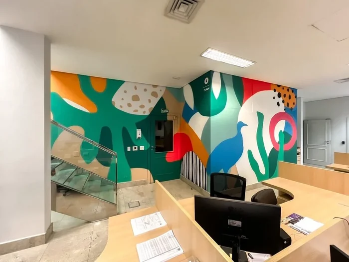
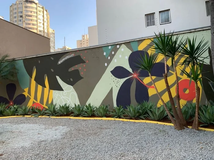
The challenge was to give the law office a distinct personality without relying on the familiar symbols of the profession. We treated the brand’s colors as raw material for an elegant abstract artwork that belongs in the space without becoming an institutional graphic.
Triangular forms guide the composition. Their bases suggest support and balance; their diagonals bring direction, tension and movement. Where they intersect, new paths open for the eye. This geometry offers a subtle parallel to legal practice: faced with adversity, differing perspectives and rules in motion, one must weigh competing forces and find alternatives.
The mural does not illustrate the law literally. Its rhythm recalls that of the city, where structures and unforeseen events coexist and each choice redraws the path ahead. Here, balance is not stillness but the ability to compose with change. In this dance between limits and possibilities, the brand’s colors gain an expression of their own, both sensitive and memorable.
Scope: Artistic mural · Spatial design