Sow Cake
Murals · Branding

For Gynoma, the identity needed to communicate gynecology and obstetrics with sensitivity, avoiding overly literal solutions for a world that called for care and delicacy.
Lato developed the project from the branding stage, creating visual identity, graphics and applications before taking that language into the clinic's spaces.
The name itself became material for the symbol. Starting with the letters G and Y in Gynoma, we developed forms that suggest different references to the specialty: an embryo and umbilical cord appear abstractly in the G, while the Y relates visually to the uterus and ovaries.
These references were reduced to a minimalist language and paired with a light palette, keeping their meaning present without making the communication overly explicit.
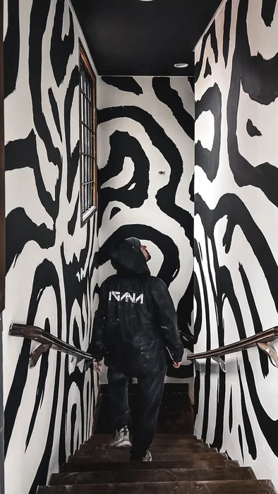
In the interiors, the same idea took on more artistic interpretations. A work made for one of the physicians explores symbols of seeds and female anatomy in an abstract, poetic way. In reception, a black-and-white mural brings art into the space without overwhelming it.
In one consultation room, the architecture itself inspired the intervention. The view of Santos Bay was symbolically extended onto the wall through a flat, minimalist composition of sea, mountains, soft colors and simplified forms.
The project connects brand, architecture and art. The same sensitivity behind Gynoma's symbol appears at another scale in the works that accompany the experience inside the clinic.
Scope: Branding · Visual identity · Murals · Bespoke artworks · Spatial design